You are using an out of date browser. It may not display this or other websites correctly.
You should upgrade or use an alternative browser.
You should upgrade or use an alternative browser.
Favourite iconic ENYA studio album cover
- Thread starter Cerro de Casa
- Start date
More options
Who Replied?Cerro de Casa
User
- Joined
- Feb 3, 2004
- Messages
- 68,342
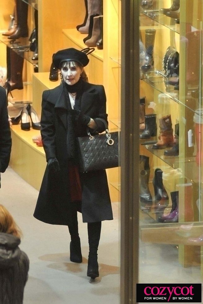
The Lady Dior hangbag tho 
BOSS LADY GET MONEY!!!
BOSS LADY GET MONEY!!!
Cerro de Casa
User
- Joined
- Feb 3, 2004
- Messages
- 68,342
Enya
Watermark
Shepherd Moons
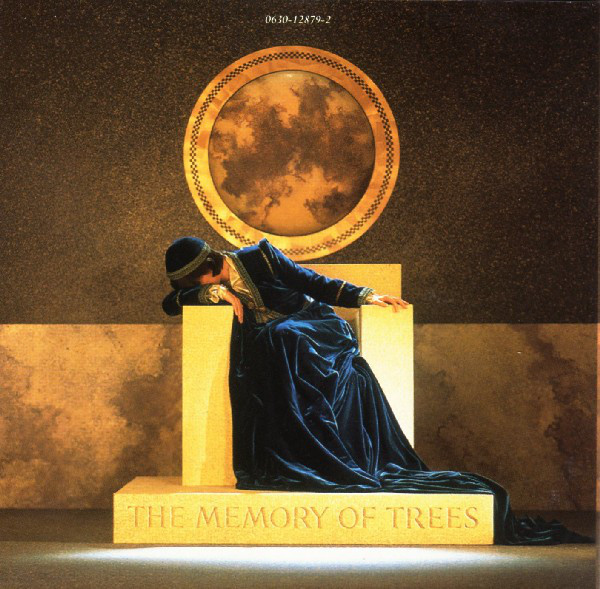
The Memory of Trees
A Day Without Rain
Amarantine
And Winter Came...
Dark Sky Island
Watermark
Shepherd Moons
The Memory of Trees
A Day Without Rain
Amarantine
And Winter Came...
Dark Sky Island
Diddy
愛してるって 言わなきゃ殺す
AND WHAT
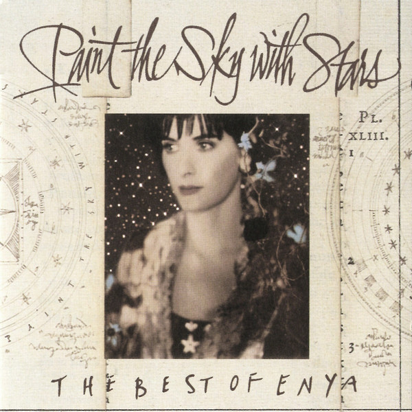
in the battle of the GH, I think Paint the sky with stars comes out on top. I love that title too.
The Very Best looks like she's being extruded from an enraged bumhole
in the battle of the GH, I think Paint the sky with stars comes out on top. I love that title too.
The Very Best looks like she's being extruded from an enraged bumhole
Cerro de Casa
User
- Joined
- Feb 3, 2004
- Messages
- 68,342

Cerro de Casa
User
- Joined
- Feb 3, 2004
- Messages
- 68,342
Saturday morning mood forever

AGinAg (38)
User
- Pronouns
- He/Him
- Joined
- Aug 3, 2009
- Messages
- 235,952
Enya walks into a bar
Barman says "why the long neck?"
Enya replies "Athair ar neamh, Dia linn
Athair ar neamh, Dia liom
M'anam, mo chroi, mo ghloir
Moladh duit a Dhia"
disneyteletubby
🕊🎼🎶🧡🔮
- Joined
- Mar 1, 2023
- Messages
- 2,456
My favourite Enya album cover is probably The Memory of Trees 

The late Gina Lollobrigida definitely inspired Enya for some photos, especially TVBOE
The late Gina Lollobrigida definitely inspired Enya for some photos, especially TVBOE
AGinAg (38)
User
- Pronouns
- He/Him
- Joined
- Aug 3, 2009
- Messages
- 235,952
@Building A Mystery WHY?THE MEMORY OF TREES Enya returns to her 'swag' roots and reminds us all who the real Queen is in this medieval royalty chic outing, sitting on her throne. Hint of Illuminati remix of course. I think of @Ag when I see this album cover
I'm not against it, and it's pure ENYACORE, but PLEASE EXPLAIN.
Suedehead
SAW YOUR FACE AND MINE
It’s everything isn’t it? Iconic, sophisticated but also… complex, maybe ominous and also mercurial
Suedehead
SAW YOUR FACE AND MINE
Those DONT FUCK WITH THE QUEEN feels thoI love the cover for Cozycot (For Women By Women)
There's a look of BARBARA here
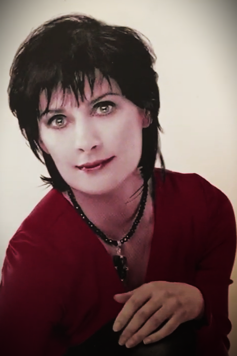
Looks like someone a bit frightening like Dannii Minogue or Louise here. This must have been the GET SEXY phaseThe racy Amarantine era never fails. The queen's very own Erotic....a
View attachment 6475
Amarantin............e
I've just spent quite a long time putting together the following rate of album covers. I DO HOPE THE EFFORT IS APPRECIATED
05 Enya - NOT the logo we've all come to love and want on our walls in crushed gold velvet with a blood red surround
11 Watermark - EBLOUISSANT
09 Shepherd Moons - Starting to look a bit deranged and like she's had her heart sawn out on this one
07 The Celts - Looks a bit BONDAGED if you ask me, but a very obvious Tarkovsky influence wall-wise. I'm thinking 'Stalker'
07 The Memory Of Trees - Getting a bit ridiculous. At least she's keeping an eye on the mice and that certainly is a very sexy cap
07 Paint The Sky With Stars - All very well, but WHERE'S THE MUCH LOVED LOGO?
07 A Day Without Rain - Looks terribly uncomfortable, like there's some bad wind brewing or she's straining for a poo
03 Amarantine - DISGUSTING. I very nearly went off her at this point. The 'Amarantine' font is VILE, the shiny leggings are horrible and generally it screams Lorraine Kelly crawling round on the floor having a psychotic breakdown
07 And Winter Came - Again, horrible font used for the title and the pony's all a bit embarrassing with a clear Modern Talking 'Romantic Warriors' influence. That said, quite nice dress and she's managed to keep pleasantly slim for the gays
10 The Very Best Of Enya - YES I THINK SO. Lovely picture, pleasing font, much-loved logo, etc.
10 Dark Sky Island - PRAISE BE. Quite the Diamanda Galas influence, although the poor love looks more comatose than ever. JUST HOW I LIKE HER
AMARANTINE our temptress enters her 'Erotica/SEX' era here, with this naughty 'get-up' which may have alienated some of her core fanbase who prefer the flowy/floral dress classic look.

A very unkind friend of mine once suggested that she might be stricken with SYPHILIS which is why she doesn't realise that all the albums sound the same
I wonder who THAT WAS

I note with disgust that it's now SIX YEARS since 'And Winter Came...' How long does it take this slothful woman to slop herself out of her syphilitic coma, slump along in her clogs to the en-suite studio and produce another 40 minute album which uses all the same vocal samples as the last one, not to mention sounding utterly identical GENERALLY? One hopes that Roma isn't holding matters up with ongoing confusion about how to conjugate the subjunctive in LOXIAN
HONESTLY EITHNE DO GET ON WITH IT

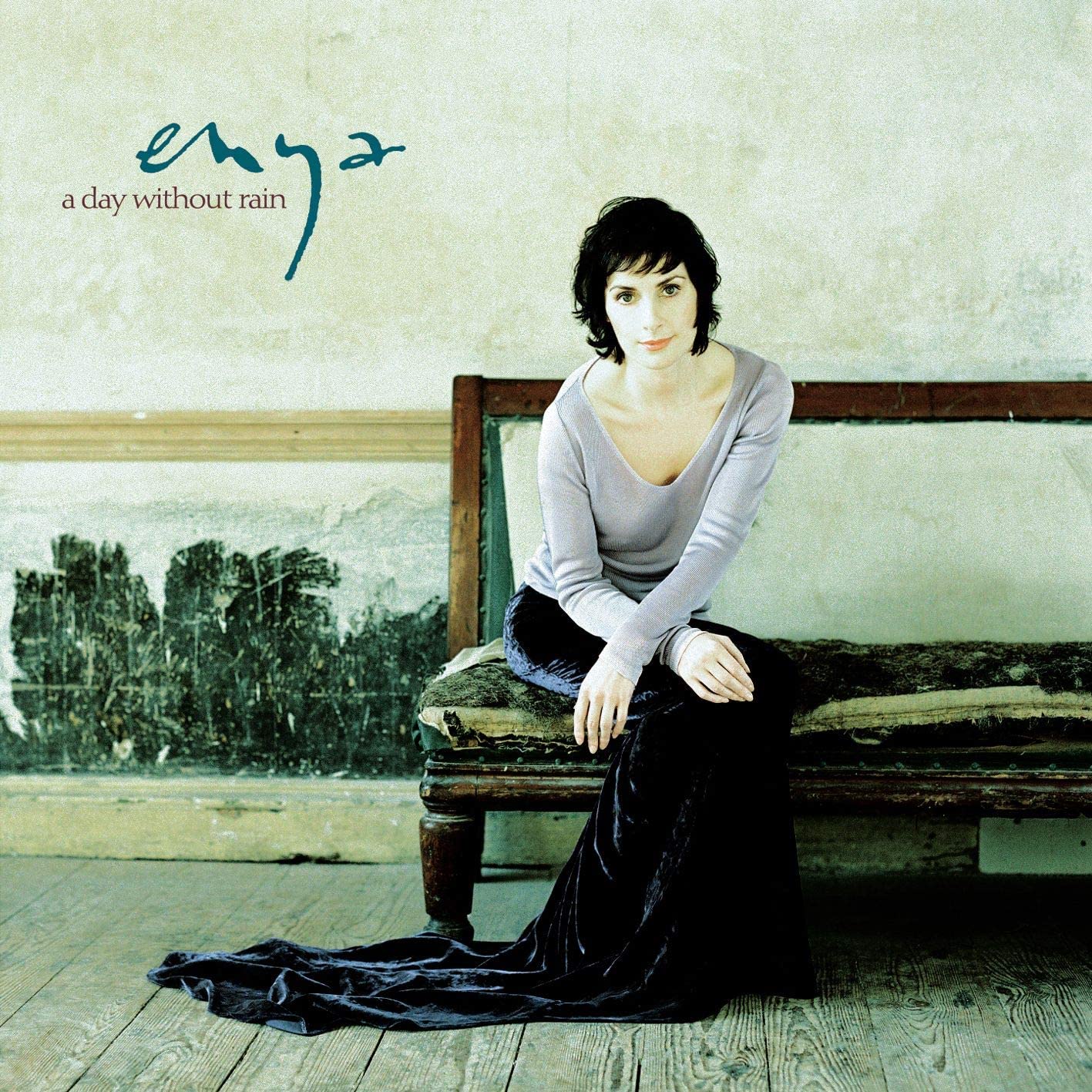
A DAY WITHOUT RAIN The queen gives us a fuss-free, almost Woolf-esque artistic album over that fits the mood of her most successful album to date in the USA. Clean, understated and to the point. Almost Taylor Swift-like
 I'm not sure that I really understand this one and what it's trying to convey. NO BRA FOR ONE, cheap arse top from H&M, an intriguing nay distressing choice of satsuma lipstick and that right tit is certainly bulging for attention
I still CANNOT EVEN with that Amarantine cover. Is the red top attached to the train AND WHY? Why is it shiny? Is this EVERYDAY CASTLEWEAR? Why is she clenching her right fist? Does it contain the key to Manderley? Who thought that LIFE'S NICER ON HALDOL made for a suitable facial expression?
SO MANY IMPORTANT QUESTIONS AND WE MAY NEVER EVER KNOW
SO MANY IMPORTANT QUESTIONS AND WE MAY NEVER EVER KNOW
disneyteletubby
🕊🎼🎶🧡🔮
- Joined
- Mar 1, 2023
- Messages
- 2,456


C
COB
Guest
Glorify The Dead
disneyteletubby
🕊🎼🎶🧡🔮
- Joined
- Mar 1, 2023
- Messages
- 2,456
Haha, the one I'd been thinking about most today was "Popcorn Is Irreversible, Kernel" - perhaps more funny than spooky 

Refers more to the songs - once these become popular hits, or 'best of' tracks , there is no real return to being that underrated little piece
This 'kernel' thing is linked to how one of the meanings for her name, Eithne, includes 'kernel' (also 'grain', 'little fire', 'source of life')
Today I also learnt that unpopped popcorn kernels are called 'old maids'
Which font(s) do people approve of out of the 'redone titles' ?
Last edited:
Suedehead
SAW YOUR FACE AND MINE
It is an impressionistic Monet afternoon delight! And that erect nipple is certainly
Marilyn
User
- Joined
- Jul 14, 2012
- Messages
- 6,765
I just tried to think about what my favourite singal cover would be but I got overwhelmed, there are so many good ones
I think I'm ready to put together a collection of my favourites
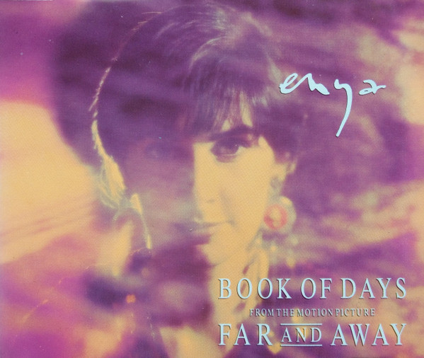
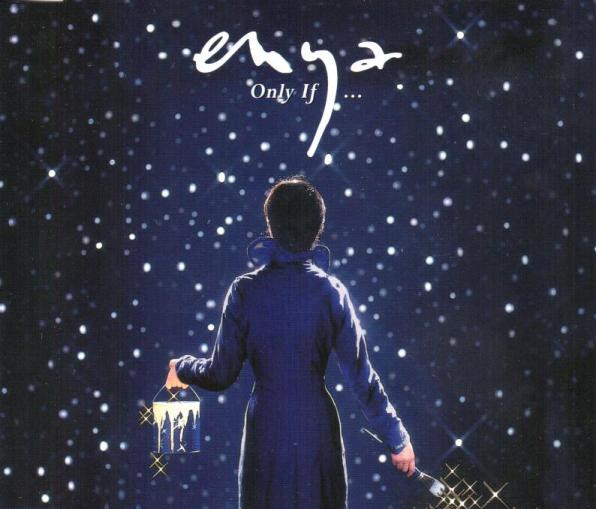
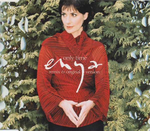
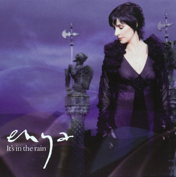
You might be wondering what sets these apart from her other single covers when basically all of them are variations on the same photograph of Enya looking forward, looking to the side, leaning down or standing up, but as we've established there's a fine line between being much-loved and being disgusting
disneyteletubby
🕊🎼🎶🧡🔮
- Joined
- Mar 1, 2023
- Messages
- 2,456
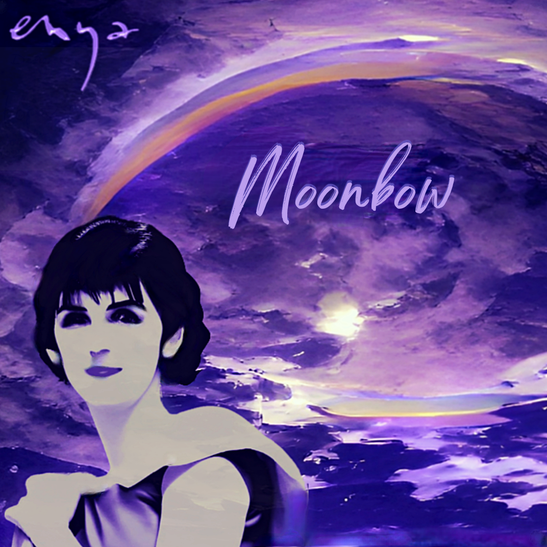
How about this one? 

Castle_Qwean
User
- Joined
- Feb 12, 2023
- Messages
- 162
07 The Celts - Looks a bit BONDAGED if you ask me
disneyteletubby
🕊🎼🎶🧡🔮
- Joined
- Mar 1, 2023
- Messages
- 2,456
My favourite Enya album cover remains The Memory of Trees
Still, I thought of mentioning Amarantine again I found the video where there's a supposedly less photoshopped/airbrushed version (right):
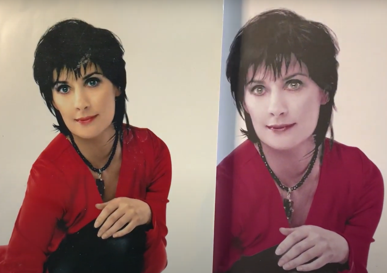
I think that with a bit more contrast, shadow
(further colour adjustments) and amaranthus flower foliage or something in the background would have made for a better cover. Oh well
Edit: I don't dislike the cover that much, but not a favourite.
Still, I thought of mentioning Amarantine again
I found the video where there's a supposedly less photoshopped/airbrushed version (right):
I think that with a bit more contrast, shadow
(further colour adjustments
) and amaranthus flower foliage or something in the background would have made for a better cover. Oh wellEdit: I don't dislike the cover that much, but not a favourite.
Last edited:
Castle_Qwean
User
- Joined
- Feb 12, 2023
- Messages
- 162
The fans you allude to must be the same ones who went crazy when these pics (from the Paris launch party) appeared:AMARANTINE our temptress enters her 'Erotica/SEX' era here, with this naughty 'get-up' which may have alienated some of her core fanbase who prefer the flowy/floral dress classic look. I know that @Zu 2 (RIP) loved to hate this.

Bonus humo(u)r link:
Interview with the Dress!
disneyteletubby
🕊🎼🎶🧡🔮
- Joined
- Mar 1, 2023
- Messages
- 2,456
I suppose it'll remain The Memory of Trees with the best album cover (and Watermark the most alluring) but I imagive that the next one could be rather distinctive (beyond the 'enyalogo') and vibrant
disneyteletubby
🕊🎼🎶🧡🔮
- Joined
- Mar 1, 2023
- Messages
- 2,456
Slightly edited,

☆☆☆☆☆
Quite cool without the angry dogs, perhaps a cape too. I think I like it better than The Celts one.
乇 N 丫 ᗅ
☆☆☆☆☆
Quite cool without the angry dogs, perhaps a cape too.
I think I like it better than The Celts one.Users who are viewing this thread
Total: 1 (members: 0, guests: 1)